
Well, now I have a completed design for the nightstand. I’ve been calling it a nightstand because that is my intended use for it. Obviously its just a little table with a drawer and could be pressed into service for just about any purpose that calls for such an item. Anyway, this design will also easily scale up or down.
In my opinion, 22″ is probably about as large as I would want to go and I’m probably already as small as I would want to go already. One thing to note about how I design is that I give very little attention to the thickness of the members. That is to say, I would not scale the thicknesses up or down if I scaled the entire piece. While not technically correct, this allows me to continue using “off-the-shelf” stock from the big box stores. There are far more talented people out there who create furniture and give great attention to the size of every item. For me, I’m just a guy in a garage and my access to lumber is somewhat limited, so I work within my limitations and make the best of it.
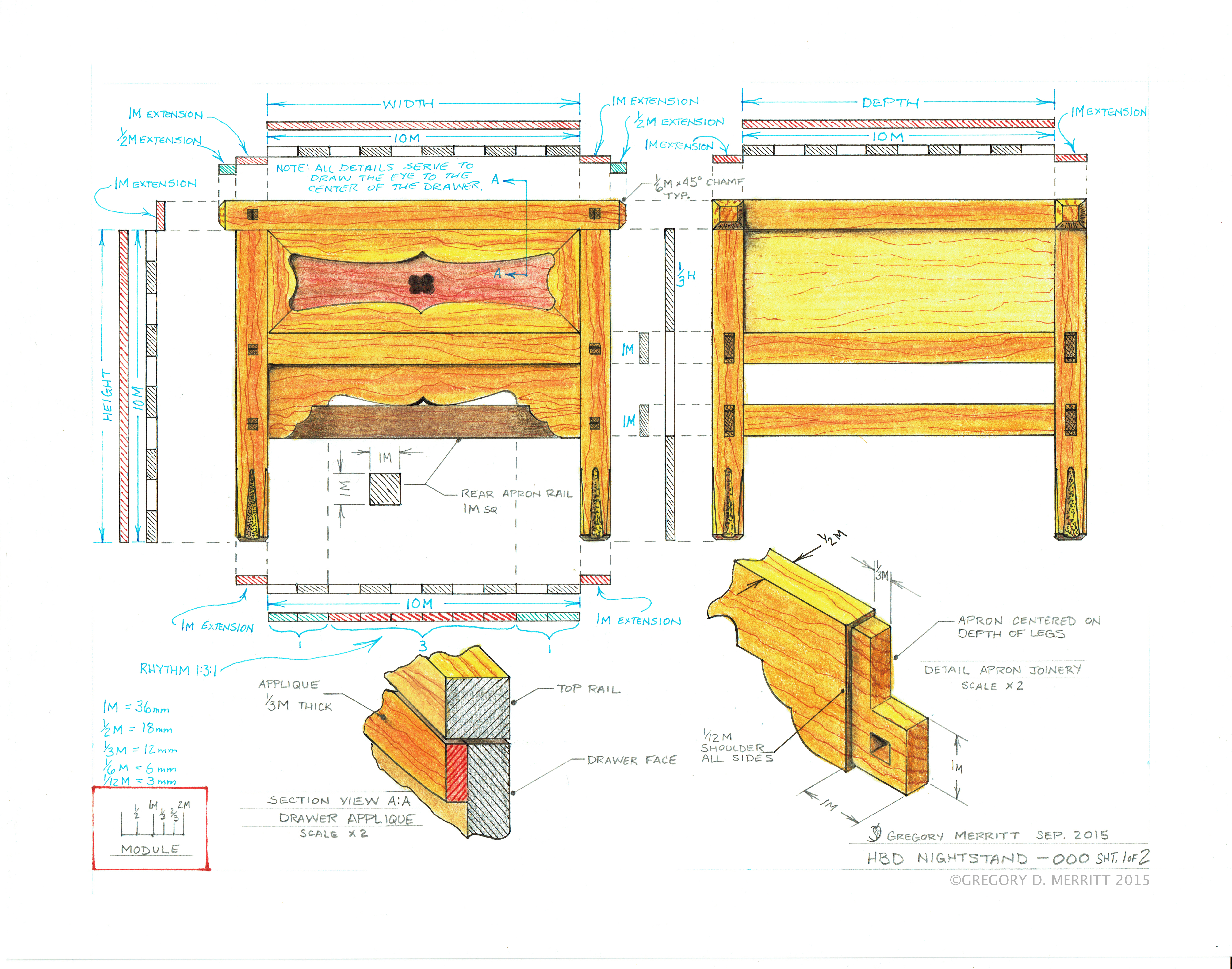
Now I’m going to walk through some of the design elements of this piece and explain my views on them. Again, I’m no expert so feel free to call “bullshit” on any of the following.
I’ll first address the front elevation since that is where the majority of the “action” takes place. As a reminder, here is what I have.

Building around a 1:1 square I first added the legs and the top rail. There is nothing all that special about these. They are sized to accommodate the size of lumber that I can acquire and the intended joinery. The primary design purpose for these elements is to frame what will be happening in the space that they enclose. The exposed tenon ends on the legs and top rail act as punctuation points to further accentuate the outer boundary.
Explaining the drawer appliqué is a little more murky. First the idea comes from my working “pallet”. How it got there is easy. This type of drawer and panel treatment shows up on many examples of asian furniture and I filed the idea away on my pallet for later use. The decorative shape is a simply what looks good to my eye plus, I had a general idea of what the apron shape would be and I wanted the appliqué to echo some of the same shapes. Particularly the sweeping horizontal curve and the tight radii in the corners.
The apron, as with the appliqué, is pulled from my working pallet. An amalgamation of shapes and patterns that I have seen on several examples of furniture. These shapes were not always on aprons, per say, but appear in several locations on furniture. I simply combined elements while taking transition cues from the proportions of the piece. The horizontal layout is done in such a way as to create a symmetrical rhythm of 1:3:1 as noted on the above drawing. Why? Because its provides better visual interest than equidistant spacing.
OK, here is where I’m going to delve deep into my own opinions and way of thinking when designing a piece of furniture. so take it with a grain of salt.
I want the focal point of this table to be the knob in the center of the drawer. As such I shaped the included elements to draw the eye to that point. The top rail and the legs frame the entire piece. Trapping the eye in that confined space. The appliqué the traps the eye into an even smaller space and the flowing curves of the appliqué lead the eye around and literally point it toward the knob. However, if the eye first lands on the lower apron, the shapes and curves of that element draw and lead the eye into the space of the appliqué which, in turn, leads once again to the knob.
I also want this piece to convey an image of strength that is firmly grounded to the floor. Again, the shapes of the appliqué and apron play a role. The lower portion of the appliqué, the cross rail and the apron work together to create a visual arch that gives a feeling of strength to the piece as well as grounding it. The lower leg detail serves to add visual weight and thus further ground the entire piece.
The side and rear elevations are identical save for the slight variation in joinery layout. I chose to keep these views of the piece simple and void of any curved decorative elements.

The lowest rail is not needed for the physical strength of the piece but serves to provide visual interest as well as visual weight to this elevation. Again, this visual weight and grounding is bolstered by the repeat of the lower leg detail and is present on all four faces of the legs.
A singular panel and the two subsequent void areas keep this elevation simple. However, note that I once again employed rhythmic symmetrical spacing. This time it’s along the vertical. The top panel and the lower void area are equal in size with the smaller void are between them.
There you have it. My design process and thinking laid bare for whatever its worth. Interesting? Maybe. Helpful? Maybe. Laughable? Probably. But, hey, I took a shot at something that’s difficult to convey. So get yourself a copy of “By Hand & Eye”, a sketchbook, view at as many examples of furniture as you can and build your working pallet of options then start designing. You can’t do any worse than I have.
pdf version: HBD Nightstand-000
Part 3 Greg Merritt

Interesting? Yes. Helpful? Yes. Laughable? Not at all. In my humble opinion, this is really enlightened work. I appreciate your effort, and thanks for sharing this.
Your most welcome and thank you for the kind words.
Pingback: Bookcase-Progress 1-Design | GREG MERRITT – BY MY OWN HANDS
Pingback: Side Table-Progress 1 | GREG MERRITT – BY MY OWN HANDS
Pingback: Nightstand Design-Part 3 | GREG MERRITT – BY MY OWN HANDS
Pingback: Staked Side Table-Part 2 | HILLBILLY DAIKU